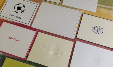
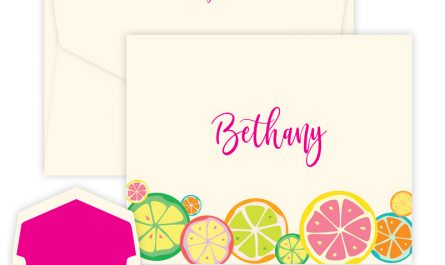
One of the many, many reasons we love personalized stationery is that we can choose a lettering style that reflects our own personal style. From classically tailored to a twist of modern, there are dozens and dozens of choices. They all say something about you, the correspondent. And if you choose wisely, it’s an accurate reflection of your unique flair. Now, sometimes, lettering styles are so special and attuned to their time that they have a kind of contemporary eloquence. These days, hand-lettered fonts are very popular. Likely a reaction to our tech-addled times, they feel organic and human.
Here are Embossed Graphics, we strive for perfection when we design our lettering styles. We pay more than standard attention to the shape of each letter and how it “speaks” to the letters around it. And we pay particular attention to the way each letter flows from one to the next. That takes years of experience.
A font that stands the test of time
One of our oldest and most successful hand-lettered fonts is “Anthony.” It’s beautifully crafted, with a nice weight to the lines, and a flowing, comfortable feel that makes it timeless. You can find this font as L01 in our ordering menus. Anthony is a natural choice when you are looking for a contemporary, hand-lettered font.
Felt-tip pen meets upscale stationery
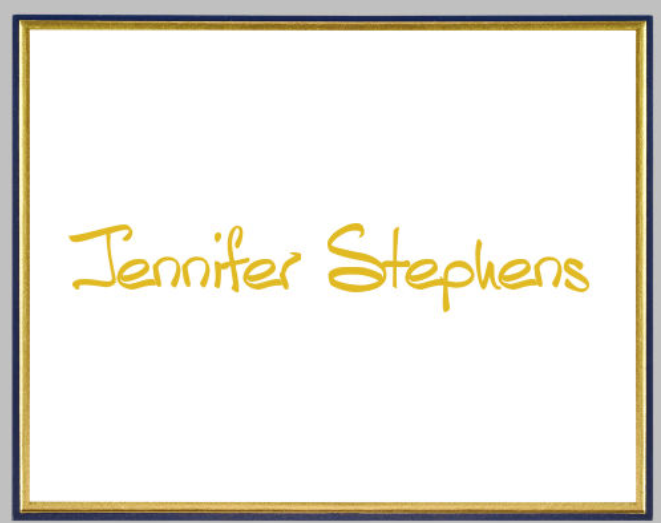
If you like your lettering styles with an organic feel, then L192 might be your thing. Reminiscent of a fine-point marker, some of the strokes actually fade, like the top of the t in the image below. There’s a casualness to it — but it’s not sloppy. The lettering is bold — that S is confident, isn’t it? — and nicely rounded in the right places that speaks of happy contentedness.
Confident but never brash
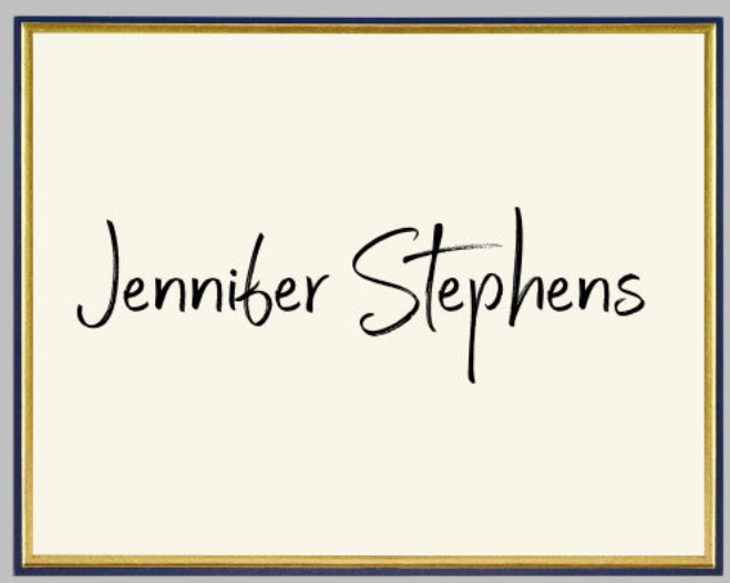
Another newer hand-lettered style on our stationery is L193. It’s a cursive font that really shows off our attention to the spacing and connections between letters. Look at the way the two n’s connect, or the way the n moves into the s at the end of Stephens. This attention to detail makes this lettering style a standout– many stationery companies won’t take the time to make their letters talk to one another like this. We love this lettering style for its casual assuredness. There’s an optimism to it, but it’s not grandiose or glad-handing. You can trust this style, can’t you?
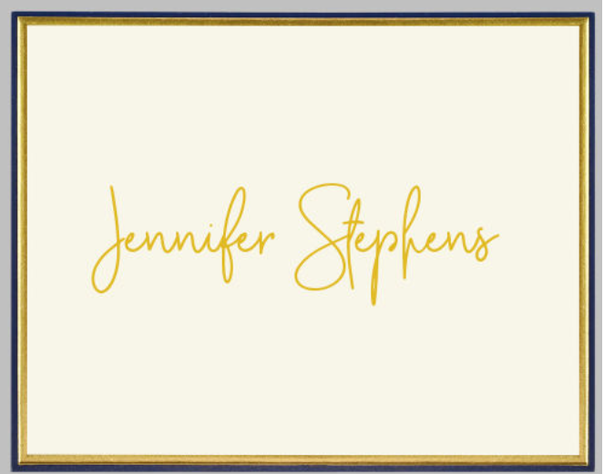
Bold-lined font that makes a connection
The last hand-lettered font we’ll show you today is L194. Like its sister above, it’s a cursive font, but it’s a bit bolder. See how the line thickness is fairly steady throughout the name? And like its sister above, the letters connect beautifully– there are no awkward transitions — the sign of our design acumen at work.
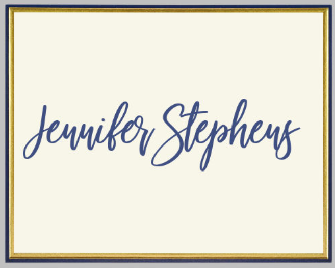
These four hand-lettered fonts show up in our new Regal Collection of folded notes. The Regal Collection is the perfect solution for gift-giving, as the price includes hand-inserted envelope linings and return addresses printed on the envelopes. The designs derive from our Silver Leaf Wedding Invitation Album, so they include special extras such as fancy edges and design treatments. The folded note in all four of these images is our Navy Minuet Note. There are 20 other designs and you can find them in the New Releases area of our website (look under “More Gifts” on the top menu), or search “Regal” in the search bar on our website.
If you need more help choosing a lettering style, visit your favorite local Embossed Graphics retailer, who can walk you through the choices. Use our store locator. Please buy local to keep people employed and pay local taxes. Your purchase of Embossed Graphics stationery not only enriches your lifestyle, it enriches your community.

